/******* Do not edit this file ******* Simple Custom CSS and JS - by Silkypress.com Saved: Aug 06 2024 | 22:27:47 */ .pr-box { border: 1px solid rgba(128, 128, 128, 0.5); border-radius: 8px; padding: 10px 20px 26px 20px ; margin : 60px 0 30px 0; font-size: 16px; line-height: 1.8; }/******* Do not edit this file ******* Simple Custom CSS and JS - by Silkypress.com Saved: Jun 02 2024 | 05:41:59 */ .tableContainer { position: relative; } .tableContainer img.swiperIcon.onSwipe { /* 画像に対するスタイルを追加する場合はここに記述 */ } .pr-table { overflow-x: auto; width: 100%; /* 変更: max-width -> width */ padding: 8px 0 0 8px; margin-left: -8px; font-size: 15px; line-height: 1.6; } .pr-table table { border-collapse: collapse; border: 1px solid #d3d3d3; word-wrap: break-word; width: 100%; /* 固定幅から変更 */ table-layout: auto; /* 追加: 列幅を自動調整 */ } .pr-table th, .pr-table td { border: 1px solid #d3d3d3; padding: 8px; text-align: left; white-space: normal; /* 変更: nowrap -> normal */ word-wrap: break-word; /* 追加: テキストの折り返しを有効化 */ } .pr-table th { background-color: #f5f5f5; } .pr-table p { margin: 0; padding: 0; } /******* Do not edit this file ******* Simple Custom CSS and JS - by Silkypress.com Saved: May 27 2024 | 14:48:23 */ @media (max-width: 768px) { .single-post .twp-related-post, display: none; } } /******* Do not edit this file ******* Simple Custom CSS and JS - by Silkypress.com Saved: Oct 15 2024 | 15:57:56 */ /* Title-4-Lines-limit */ .wpp-post-title { display: -webkit-box; -webkit-box-orient: vertical; overflow: hidden; -webkit-line-clamp: 3; line-clamp: 3; } /* Ranking-Number */ .wpp-list li { counter-increment: ranking; /* カウンターを1ずつ増やす */ position: relative; /* 相対位置設定 */ } .wpp-list li:before { content: counter(ranking); /* カウンター表示 */ position: absolute; /* 絶対位置指定 */ left: 3.8em; /* 左端から表示 */ top: 0.25em; /* 各アイテムの上端に固定 */ width: 34px; /* 背景の幅 */ height: 32px; /* 背景の高さ */ background-color: #f88c00; /* 背景(デフォルト:1-3位用の赤色) */ font-weight: bold; /* フォントを太く */ color: #FFF; /* テキストの色を白に */ font-size: 1.8em; /* フォントサイズ指定 */ line-height: 1.2em; /* 行の高さを背景の高さに合わせる */ text-align: center; /* テキストを中央揃え */ vertical-align: middle; /* 垂直方向の中央揃え */ } .wpp-list li:nth-child(n+4):before { color: #fff; /* テキストの色を白に */ background-color: #444; /* 4-10位用のオレンジ色に変更 */ } .wpp-list li:nth-child(n+2):before { top: 0.8em; /* 2位から10位の数字の位置を少し下げる */ } /******* Do not edit this file ******* Simple Custom CSS and JS - by Silkypress.com Saved: Aug 16 2024 | 22:07:31 */ /* ◆◆モバイル&Tablet画像縦横比維持 */ @media only screen and (max-width: 767px) { .post img { max-width: 100% !important; height: auto !important; } } /* ◆◆PUMA系の黒ボタン */ .pr-button a { display: block; width: 80%; margin-left: auto; margin-bottom: 50px; margin-right: auto; width: 80%; /* ボタンの幅を親要素の80%に設定 */ /* max-width: 300px; 必要に応じてボタンの最大幅を設定 */ margin-top: 20px; /* 上部の余白を20ピクセルに設定 */ border-radius: 8px; background-color: #000; color: #fff; font-size: 15px; font-weight: 600; line-height: 24px; padding: 12px 18px; text-align: center; text-decoration: none; min-width: 166px; } /* ボタン内のリンクにアンダーラインを付けない */ .pr-button a { text-decoration: none; } /* ボタンのカスタムスタイル(必要に応じて追加)*/ .pr-button--custom a { /* カスタムスタイルの例: 背景色を変更 */ /* background-color: #f00; */ } /* 全ての要素に共通のボックスモデル設定 */ *, *:before, *:after { box-sizing: border-box; } /* ◆◆アディ系の見出し灰帯 */ ul { list-style-type: none; padding-left: 0; } ul li p, ul li > strong { width: 100%; box-sizing: border-box; margin: 0; color: #111; } ul li p strong, ul li > strong { display: block; background-color: #ededed; padding-top: 18px; padding-bottom: 16px; padding-left: 18px; padding-right: 18px; margin-top: 30px; /* 上の余白を30pxに設定 */ margin-bottom: 24px; /* 下の余白を24pxに設定 */ } /* ◆◆アディ系テーブルの見出しBOX、コナミ系テーブル調整とスワイプ画像非表示 */ .tableWrapper table { width: 100% !important; /* テーブルの幅を親要素に合わせる */ max-width: 700px; /* 最大幅を700pxに設定 */ border-collapse: collapse; /* 枠線を重ねて1本の線にする */ border: 1px solid #000; /* テーブル全体の枠線を設定 */ box-sizing: border-box; /* パディングとボーダーを幅に含める */ } .tableWrapper td, .tableWrapper th { word-break: break-word; /* 単語が長すぎる場合は改行する */ border: 1px solid #000 !important; /* セルの枠線を設定 */ } .swiperIcon { display: none; /* 画像を非表示にする */ } .swiperIcon onSwipe { display: none; /* 画像を非表示にする */ } /* ◆◆テレビ大阪系キャプション回込み */ .text-image-caption { display: flex; flex-direction: column; align-items: flex-start; width: fit-content; } .text-image-caption img { width: 100%; height: auto; } .image-caption { width: 100%; font-size: 0.8em; color: gray; } @media only screen and (max-width: 767px) { .text-image-caption img { max-width: 100% !important; height: auto !important; } .text-image-caption { width: 100%; } .image-caption {        font-size: 0.8em; } } /* ◆◆YouTubeスマホでも横長に表示 */ .video-wrapper { position: relative; padding-top: 56.25%; /* 16:9 Aspect Ratio */ height: 0; } .video-wrapper iframe { position: absolute; top: 0; left: 0; width: 100%; height: 100%; } /* ◆◆長いURLを改行 */ a { overflow-wrap: break-word; word-break: break-word; } /* ◆◆記事下レコメンドの透かし非表示 */ .twp-single-next-post:before { content: none !important; } /* ◆◆画像の横に並ぶテキストを下に回り込み */ .alignleft { float: none !important; display: block; margin: 0 auto; } /* ◆◆NewBalance他の<P>タグの改行 767ピクセル以下のデバイスに適用されるスタイル */ @media only screen and (max-width: 767px) { p { text-align: justify; /* テキストを均等揃えにする */ text-justify: inter-word; word-break: break-word; /* 単語が端に到達したら改行する */ } p a { display: block; /* リンクをブロック要素として扱い、新しい行に表示 */ white-space: normal; /* リンクのテキストで改行を許可 */ word-break: break-all; /* 任意の場所で単語を改行する */ } } /* ◆◆サイドバー箇所のwidgetのCommentウィ表示にする */ .tab-comments { display: none; } /* ◆◆セイコーや陸上連盟の行間調整 */ p br + br + strong { display: block; margin-top: 1em; /* 行間のマージンを調整 */ } /* ◆◆PCヘッダーSVGロゴのサイズ調整 */ .twp-logo img { height: 103px; width: auto; /* 幅を自動調整してアスペクト比を保持 */ } /* 最初の3つの空のpタグを通常通り表示し、4つ目以降を非表示にする */ p:empty:nth-of-type(1), p:empty:nth-of-type(2), p:empty:nth-of-type(3) { display: block; /* 必要に応じて表示設定 */ } /* ◆◆アディダスほか、小さい画像を親要素の幅に。400px未満は400pxで */ .text-image-caption img { width: 100% !important; height: auto !important; object-fit: contain; /* 画像がコンテナより小さい場合、その実際のサイズで表示される */ } /* ◆◆固定ページの新着一覧の投稿タイトルを2行に */ .pt-cv-title { display: -webkit-box; -webkit-line-clamp: 2; -webkit-box-orient: vertical; overflow: hidden; text-overflow: ellipsis; } /* h1見出しサイズ調整 */ @media screen and (max-width: 768px) { .entry-title:not(.entry-title-large) { display: block; -webkit-line-clamp: unset; -webkit-box-orient: unset; overflow: visible; } h1 { font-size: 1.3em !important; } h2 { font-size: 1.3em !important; } } /* h2見出しサイズ調整 */ h2 { font-size: 1.5em !important; }

軽くて機能的な、アウトドアテイストのオンオフ兼用バッグ「ace. ファルテライト」発売


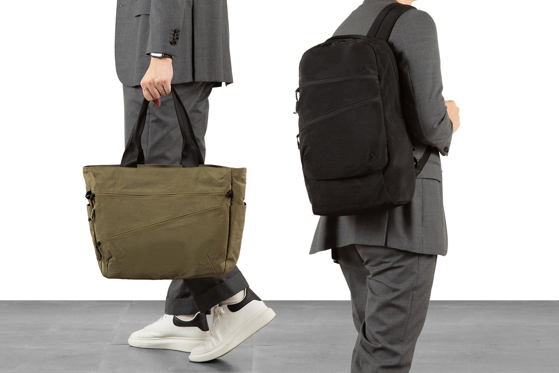
バッグメーカーのエース株式会社(本社:東京都渋谷区 代表取締役社長:森下 宏明)は、バッグ&ラゲージブランド「ace.」(エース)より、軽量で機能性に優れた、アウトドアテイストのカジュアルバッグシリーズ「ファルテライト」を発売します。

全国のロフト11店舗にて2025年8月14日(木)より先行発売を開始。

直営店、オンラインストア、全国主要百貨店・専門店にて8月下旬より順次発売します。
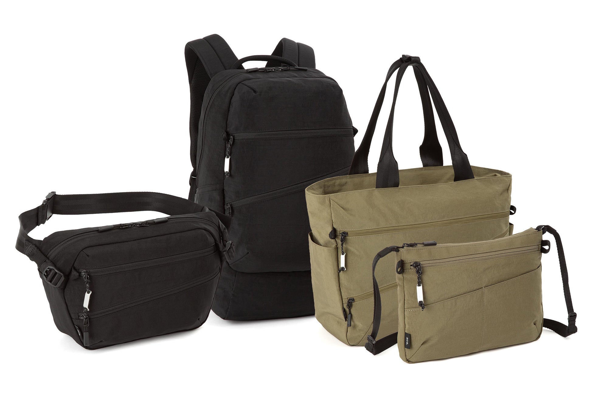
【商品特徴】

アウトドアテイストの素材&デザイン

本体素材には、自然なシワ感とハリ感を兼ね備えた、ワッシャー加工のナイロン生地を採用。

撥水・撥油性に優れたテフロン加工を施し、機能性と見た目の美しさを両立しました。

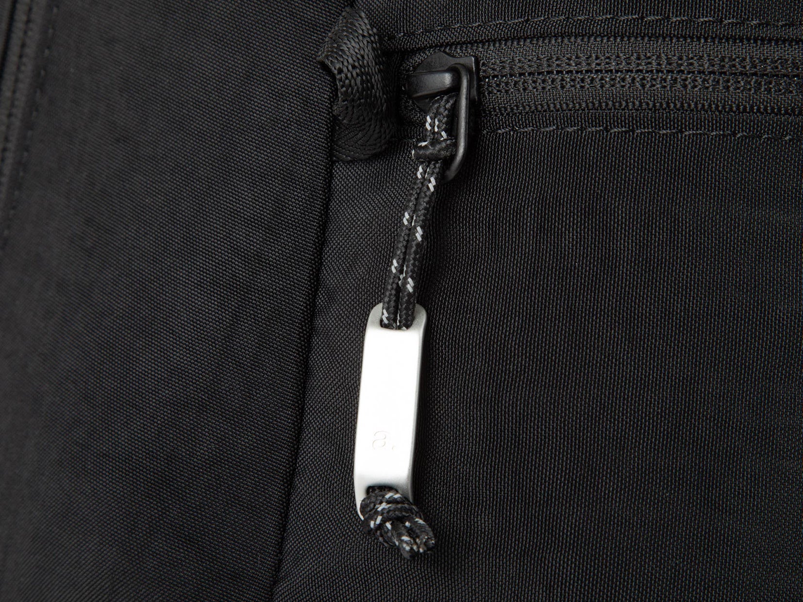
フロントポケットには、軽量なオリジナルアルミ引手を配し、アウトドアライクなアクセントを添えています。

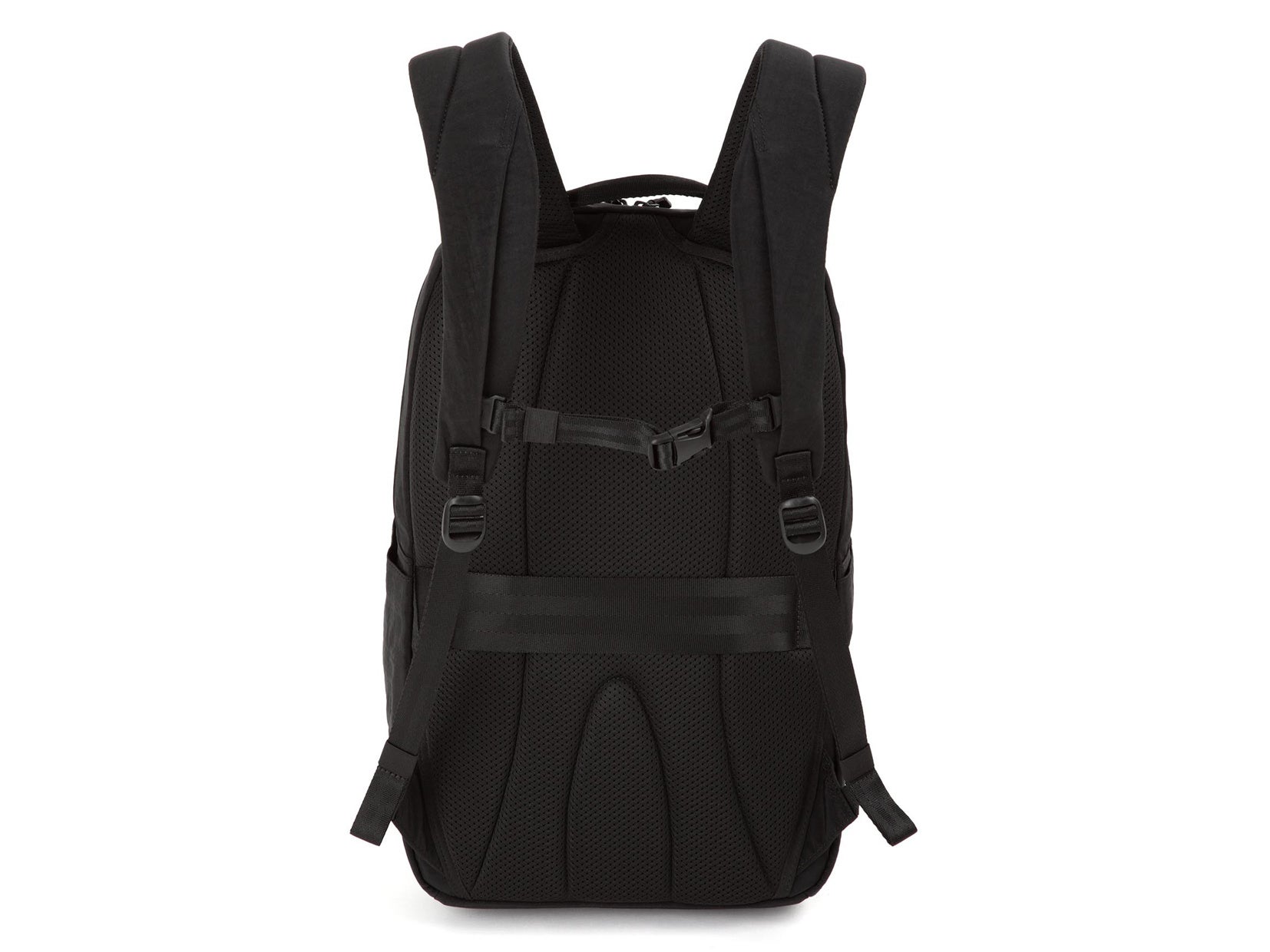
背負い心地を高める背面&ショルダーハーネス

背面とショルダーハーネスには通気性の高いエアメッシュを採用し、蒸れを軽減。

加えて、ショルダーハーネスに着脱可能なチェストベルトを装備し、体へのフィット感を向上させました。
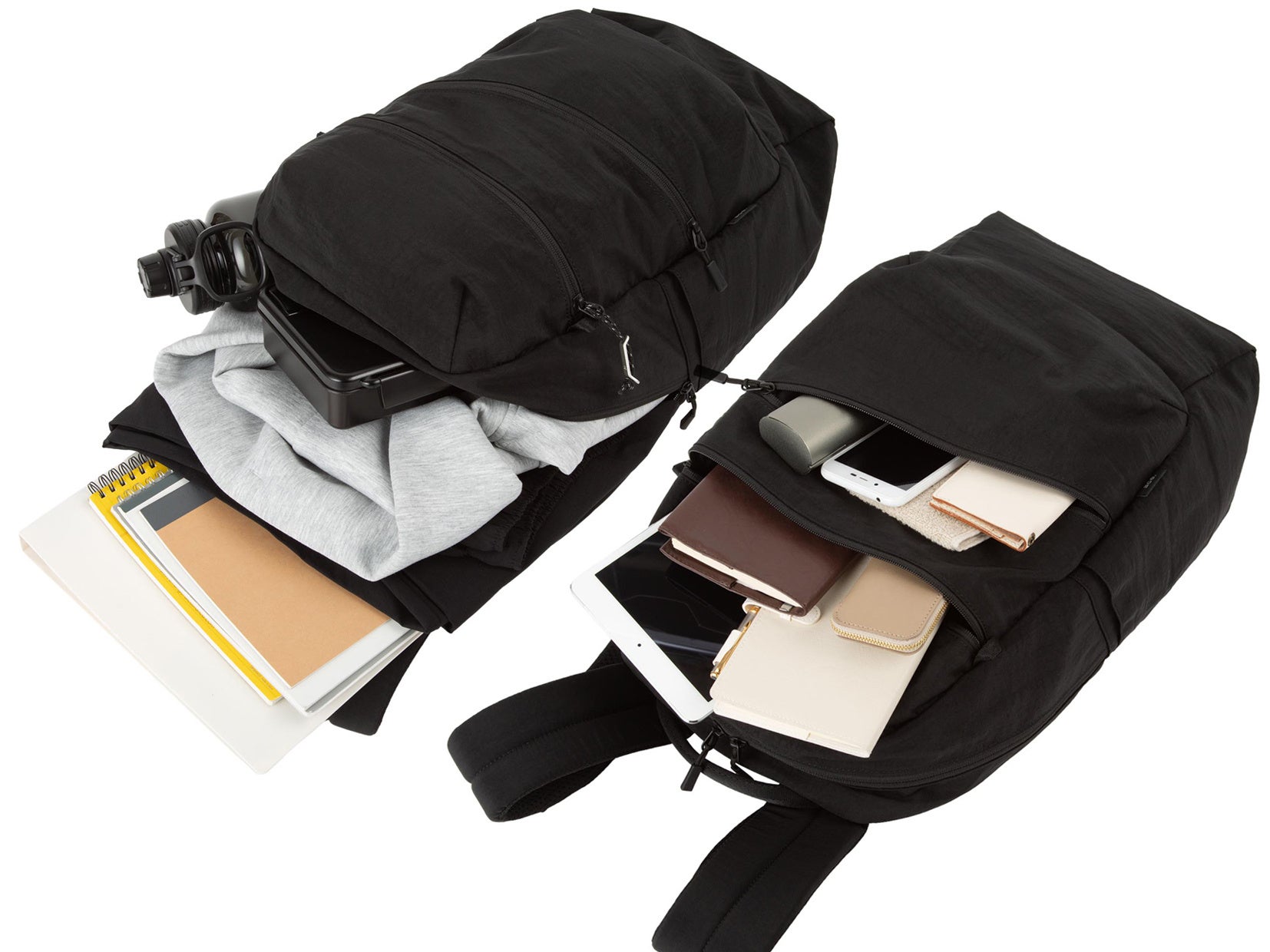
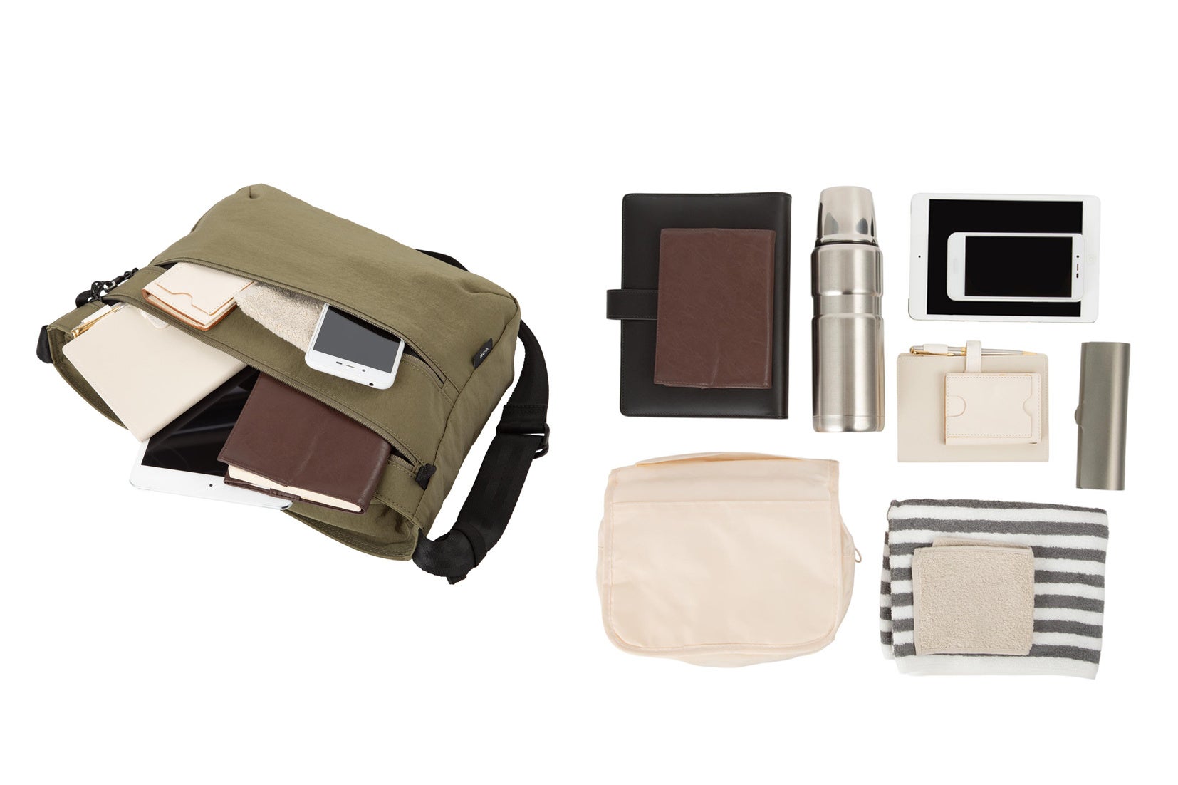
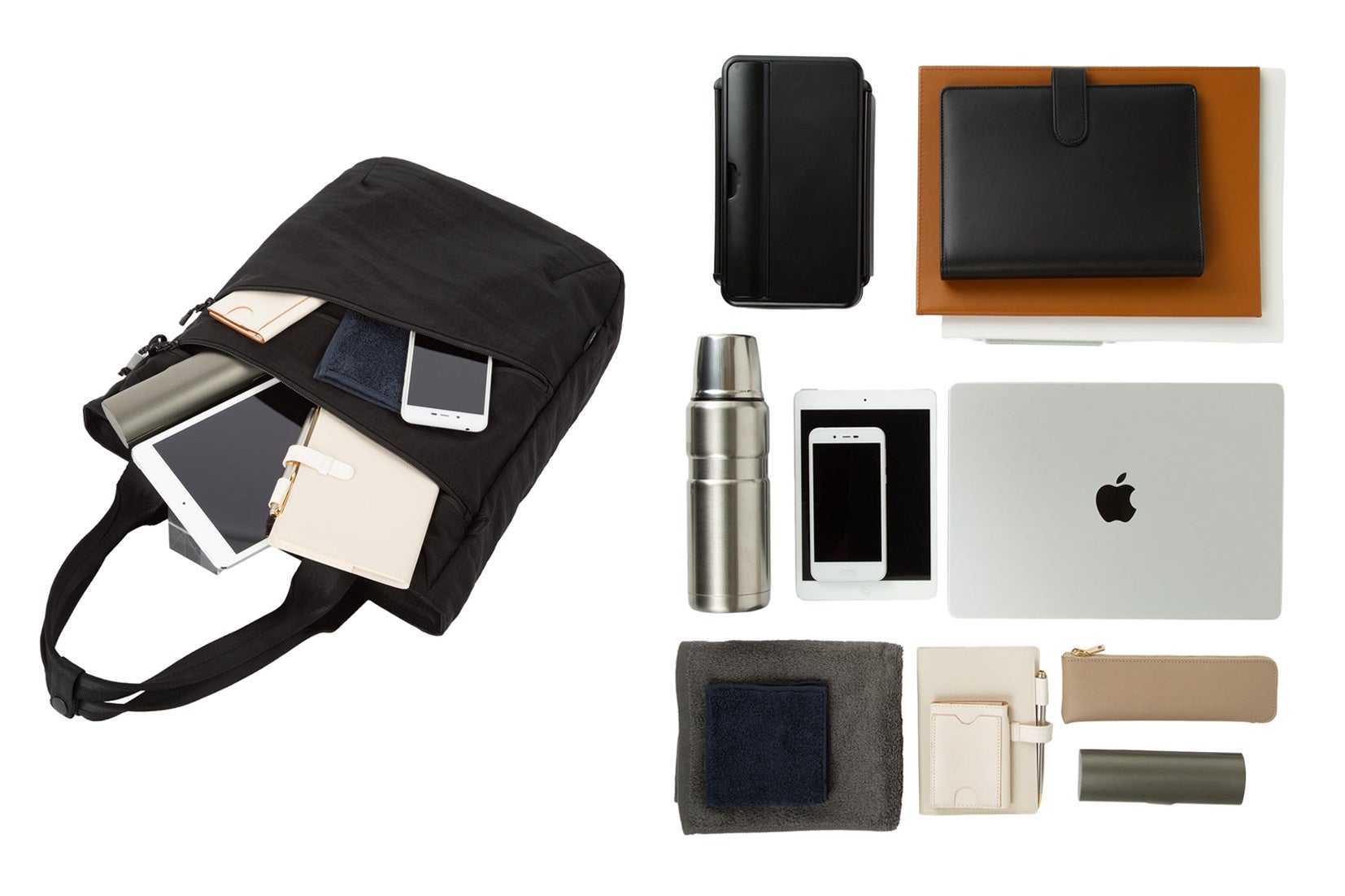
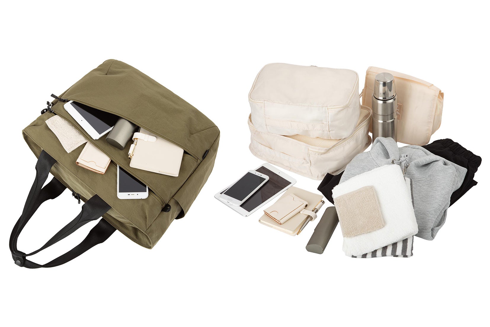
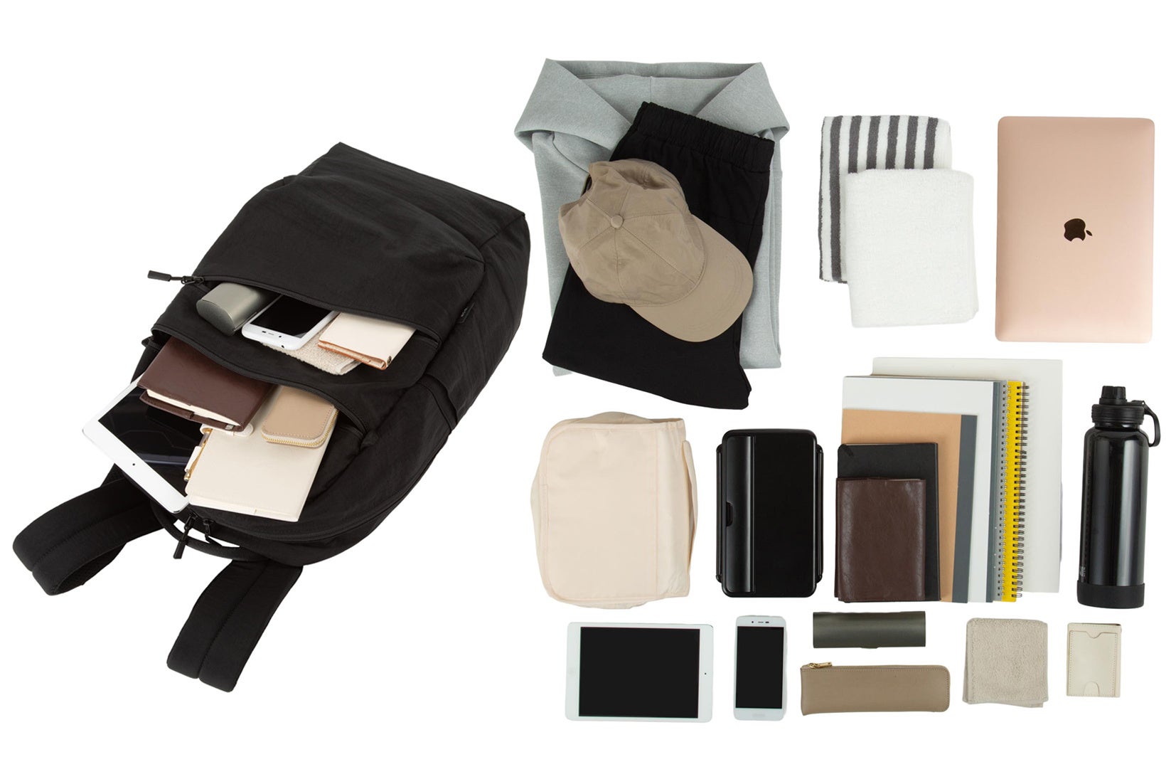
整理しやすい収納設計

内装には小物類の整理に便利な「オーガナイザーポケット」を備えます。

さらに、トート・リュック型には13.3インチPC対応の「PC収納スペース」を搭載。

オンからオフまで幅広いシーンに対応します。
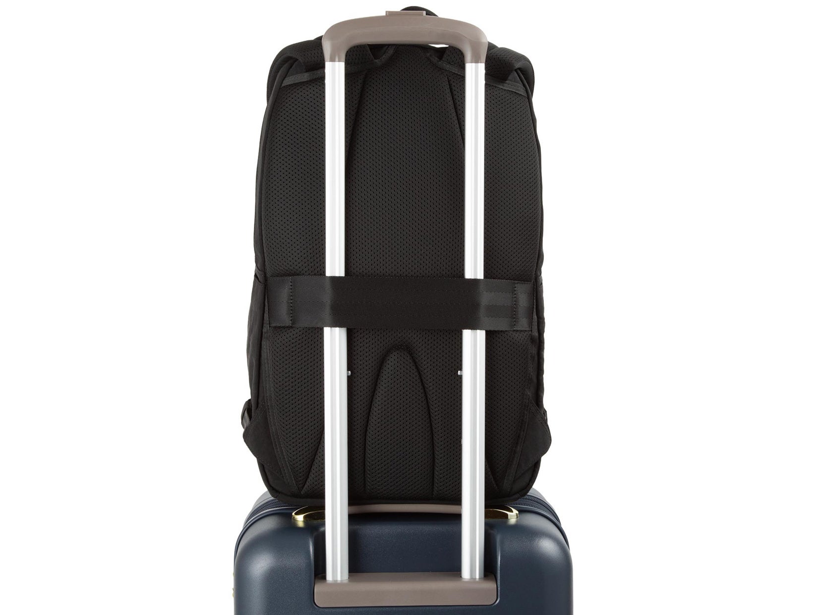
旅行・出張に役立つセットアップ機能

トート・リュック型には、スーツケースのプルドライブハンドルに固定できる「セットアップベルト」を装備。

移動中のバッグのふらつきを防ぎ、旅行や出張時にも便利です。
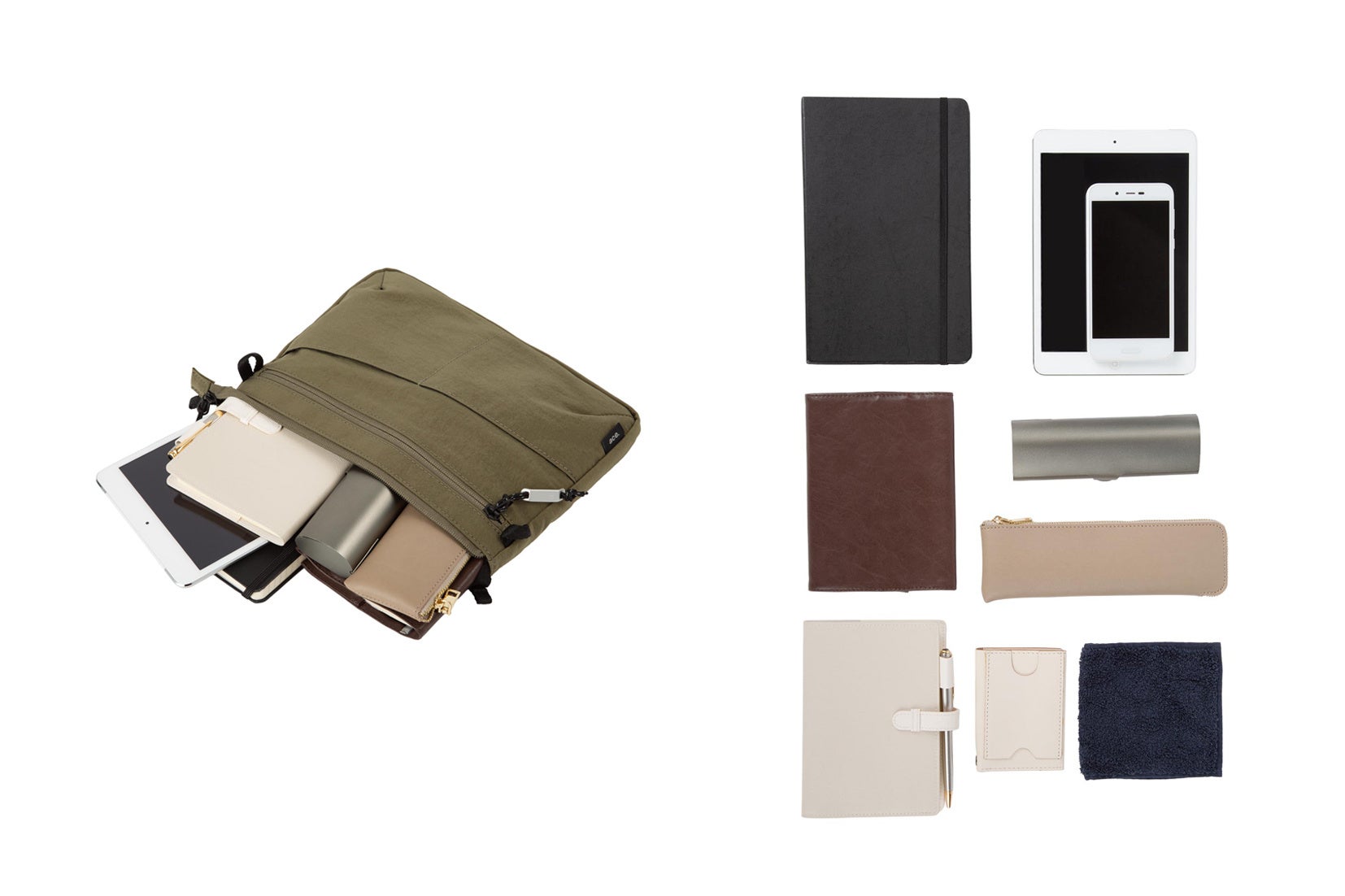
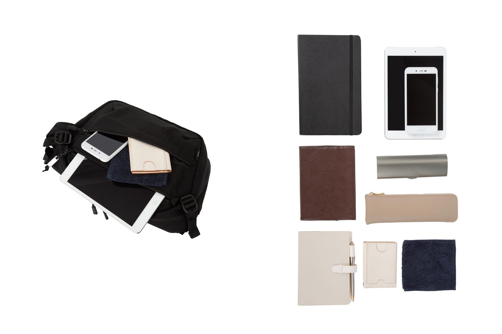
【収納イメージ】

ショルダー小(17891)
スリングバッグ(17892)
ショルダー大(17893)
トートバッグ縦(17894)
トートバッグ横(17895)
リュックサック(17896)

【商品詳細】

ブランド:ace.

シリーズ: FALTELIGHT(ファルテライト)

素材:ナイロン(テフロン加工)

カラー:ブラック、カーキ

形状/品番/サイズ(W×H×D)/容量/重量/税込価格:

ショルダー小/17891/27×20×3cm/2L/180g/13,200円

スリングバッグ/17892/33×19×9cm/5L/320g/16,500円

ショルダー大/17893/38×25×10cm/9L/380g/19,800円(A4対応)

トートバッグ縦 /17894/34×39×10cm/15L/500g/22,000円(13.3inch/A4ファイル対応)

トートバッグ横 /17895/43×34×15cm/22L/610g/24,200円(13.3inch/B4ファイル対応)

リュックサック /17896/30×46×16cm/22L/770g/25,300円(13.3inch/B4ファイル対応)

左から、スリングバッグ、リュックサック、トートバッグ横、ショルダー小

【先行発売店舗】

全国ロフト11店舗

(池袋ロフト、渋谷ロフト、吉祥寺ロフト、横浜ロフト、千葉ロフト、銀座ロフト、新潟ロフト、二子玉川ロフト、大宮ロフト、川崎ロフト、仙台ロフト)

【ace.(エース)とは】

1940 年創業の日本のバッグメーカー『エース株式会社』が手掛けるバッグ&ラゲージブランド。

「すべての移動を旅と捉え、その移動を快適にする最適なカタチを提供する」ことをコンセプトに、トラベルからカジュアル、ビジネスまで幅広い種類のバッグを提供。日本含むアジアマーケット中心に展開中。

ブランドサイト:https://www.ace-dot.com/

エースオンラインストア:https://store.ace.jp/


Next Post

食ビジネスの第一線が集結!「日本の食ビジネス カンファレンス 2025」9月5日(金)開催 ~魚・肉・野菜・米・酒、5ジャンルの著者が描く日本の食の未来~

木 8月 14 , 2025
ビジネス書出版社を母体とするクロスメディアグループ株式会社(本社:東京都渋谷区、代表取締役:小早川幸一郎)は、 […]

今週、読まれている記事

カテゴリ一覧